How to interpret results?
- Metrics Dashboard
- Relative metrics
- Diagnostic
- Influencers
- Trend
- Competitive analysis
- Industry standard
- Custom Segments
Metrics report
Use this report to measure the real active engagement of users with your Social Media Pages. Did your posts evoke conversations, encourage followers to share your information, or induce them to like your valuable content? And to find out which social networks are the most effective fro your business.
Amplification rate - indicates how many times on average each of your posts was Shared/Retweeted
(e.g. Amplification rate = 5 means that each of your posts was shared 5 times on average).
Conversation rate - indicates how many Comments/Replies on average each of your posts has received
(e.g. Conversation rate = 5 means that each of your posts has received 5 Comments/Replies on average).
Applause rate - indicates how many Likes/Favorites on average each of your posts has received
(e.g. Applause rate = 5 means that each of your posts has received 5 Likes/Favorites on average).
Economic value - shows how much Economic Value each visit from a social network brings to your site by completing your site goals
(e.g. Economic value = $5 means that each visit from this social media site brings your business $5 in value).
Relative metrics report
Relative metrics show (by default) the activity per 1000 Followers, which helps you accurately compare between several accounts that have a different number of Followers. It is recommended to use relative metrics when comparing your results to those of your competitors. This is how it is calculated:
Relative Amplification rate = # of Shares/ (# of Posts * # of Fans) *1000
Why is this important? Because having 50 Likes per Post with 500 Followers is a great achievement, but having 50 Likes per Post with 5 million Followers is a great defeat. Also, since you and your competitors have a different Number of Followers, this difference needs to be taken into account to accurately compare your results. That’s why it is helpful to calculate Relative metrics per Followers.
Here’s an example of the calculation for Pizza Hut in Facebook:
Relative Conversation rate = (312/8083591)*100 = 0,004
where: Conversation rate = 312, Number of Fans = 8083591
This means that on average, 1 Fan leaves 0.004 Comments per 1 Post. The Relative conversion rate for their competitor, Domino’s Pizza, is 0.002. Knowing this, we can now see that Pizza Hut is more successful at engaging their Fans, or that they simply have more active Fans.
Use a switcher at the bottom of the page to select per how many followers you wish the metrics to be calculated (per 1, or 10, or 1000 etc.). (per 1, or 10, or 1000 etc.). It is easier to report to a boss that you have 5 Likes per post per 1000 Followers, than 0.005 Likes per post per 1 Follower.
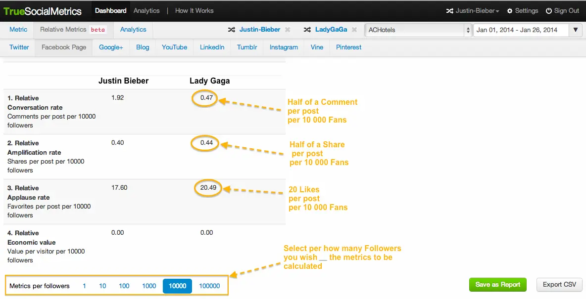
In this example, Justin Bieber's 62 million Fans in Facebook are more active at Commenting, but less active in Liking when compared to Lady Gaga's 62 million Fans. Thus, Lady Gaga is proclaimed the "Queen of Love" while Justin Bieber is the "King of Conversation" :)
Diagnostic report
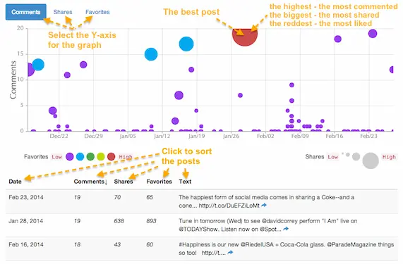
This report helps you identify which topics are more engaging to your fans, and which are less engaging, so that you can make the content in your social media pages more effective.
To interpret the data on the graph, use “The Sun rule”: where the best posts are colored red, are larger and are positioned higher on the graph.
You can sort all of the posts in the table below the graph by the number of shares, comments, likes, or date. By default, all posts are sorted by date - from the newest to the oldest.
Influencers report
Analyzing users who engage with your posts and also have the most followers, helps you to identify with whom you should establish closer relationships, allowing you to become visible to a larger audience. E.g. if you post topics that are more interesting to your top influencers, they will share those posts with their followers.
There are four types of users:
- Engaged - users who engaged more than once with your posts (conducted some activity - liked, shared, commented)
- Sharers - users who shared your posts
- Repliers - users who commented on your posts
- Likers - users who liked your posts
Repliers, Sharers and Likers lists are sorted by the number of followers that the listed users have. This helps to identify the most influencing users who are also engaged. For example, when you see the very top person in the Sharers list: “Irvin Hamilton 1030” it means that this user has shared your post, and has 1030 followers, which is the largest number of followers among all of the sharers for the selected date range and/or segment.
The Engaged list is sorted by the number of activities that users conducted on your social media accounts - likes, shares, comments.
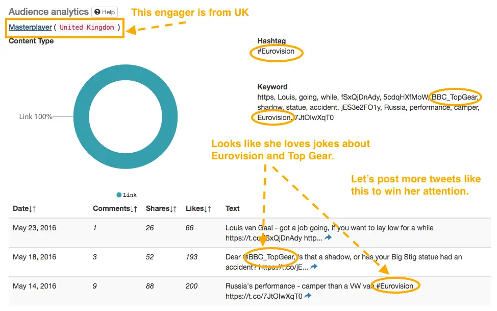
Gender and Geographical location are determined for the engaged users. Location will let you know the engager’s time zones to help you identify the best time to post.
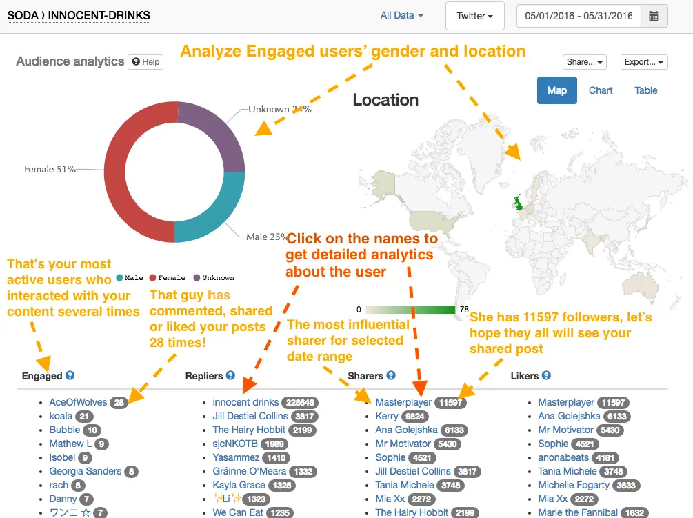
In “Engaged users” list click on the number of times each user engaged with your account, and you will see a detailed analytics of content this user has been interested in. Get ideas about topics and content types that might engage your most active fans.
Trend report
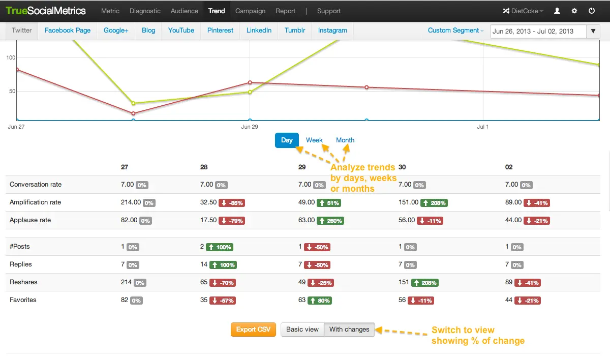
This report helps you track your social media pages’ performance over time to spot some engagement fluctuations due to seasonal changes, holidays, your campaigns, competitors' activities etc.
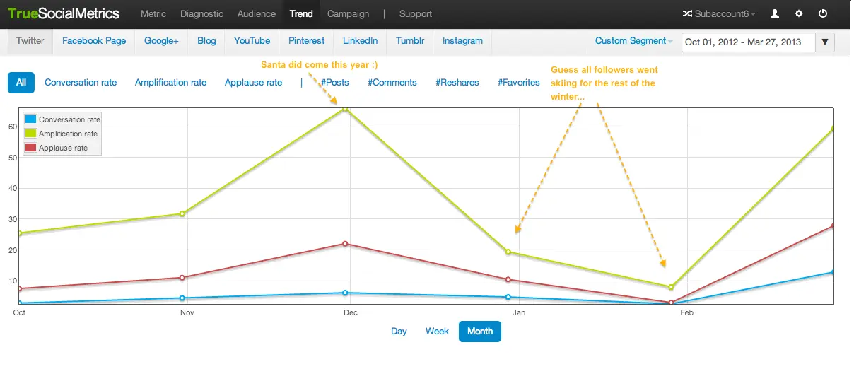
You can also track your posting density and understand how it influences the engagement level.
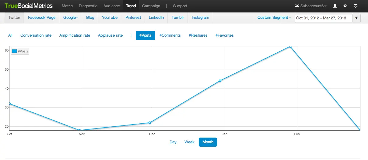
In this example, there are more posts in January and February, but there is less engagement. This indicates when quantity doesn’t equal quality.
You can also instantly compare the % of change for each metric by days/weeks/months using the “With changes” view. This is very useful for reporting purposes. For instance, “Our Amplification rate increased 1000% compared to the previous month” sounds more impressive than “Our Amplification rate is 100”. This data also helps to measure the effectiveness of your social media strategy improvements.
Competitors analysis report
The best way to know if your results are good or not is to compare them to your competitors’ results. Every kind of analysis that is available for your social media accounts, with the exception of the Economic value metric, can also be calculated for your competitors’, with no login credentials required.
Of course, you and your competitors will have a different number of followers. So for more accurate results that are not biased by the number of followers, use Relative metrics. that are averaged based on the number of followers. This will show you the conversation, amplification, and applause per 1000 followers *by default).
Learn how to set up competitive analysis here.
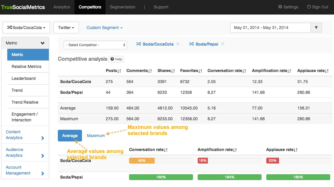
You can select unlimited (depends on your subscription type) number of accounts to compare simultaneously and there are 2 reporting views you can switch to:
- Average - an average result, calculated as the average value for all metrics among the accounts you have included in the report.
- Maximum - the best result, calculated as the maximum value of metrics among the accounts included in the report.
For example, the screenshot below shows that Coca Cola has reached only 28% of the maximum possible result for Conversation rate on Twitter, based on the results from Coca Cola and 4 of their top competitors’ results (Maximum tab).
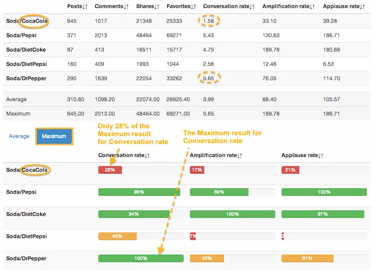
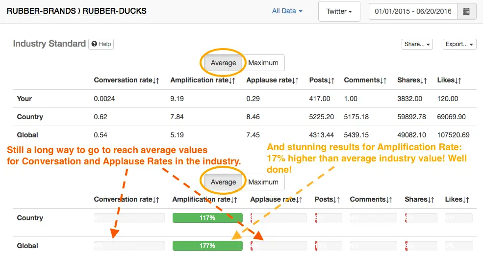
As for the Average tab, it shows how your and competitors’ accounts are performing compared to the average industry results. Here, 100% is the average value, and for example, 50% would indicate that your results are half that of the average among selected accounts.
Industry standards report
Industry Standard is 100%. Thus, 100% means that your metrics are equal to the standard. Everything above 100% indicates the amount that your metrics are higher than the standard, while everything lower than 100% indicates the amount that your metrics are lower than the standard.
Custom segments
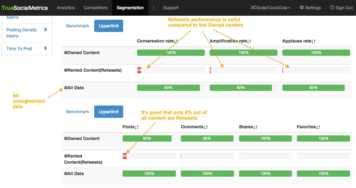
Divide and Conquer. Easily segment and analyze data, and then compare several segments to find out what type of content is the most engaging for your followers.
Some ideas for Segments:
- Compare segments to find the most engaging content: retweets vs your own posts; compare posts with different topics, hashtags etc.
- Campaign performance analytics: compare campaign posts vs usual content.
- Best/worst posts analytics: analyze non-viral posts, most liked posts, posts without comments etc.
E.g. if you have a Twitter campaign using the hashtag #ShowYourHeart, you can create a segment with that hashtag and analyze the campaign’s posts performance on the Diagnostic page. Applying a segment on the Audience page, you will see the most active participants of the campaign. And so on.
Learn how to manage and create custom segments here.
Examples of interpretation
Take a look at these case studies describing examples of the usage and interpretation of TrueSocialMetrics features.
For more information please Contact us.
